- Question 7 Draft-
- 1. Question 7: Looking back at your preliminary task, what do you feel you have learned in the progression from it to the full product?
- 2. Development- Font scheme I developed my use of font because as we can see, in my college magazine I did not follow the rule of maximum 3 fonts being used. One of the biggest mistakes I made was having a different font for ‘Contents’ because it did not look like it was part of the front cover. However, In my music magazine, after experience I figured out that using the same/similar font would look a lot more special so I used the same font without the spikes. Also, the font of the skyline matched the font I used throughout the magazine. However the skyline font on my college magazine was a completely different font compared to the rest of the magazine. In addition, as we can see the word ‘STYLE’ covers the models head in my college magazine. I believe not having any writings covering the models face made my music magazine look a lot more professional. Overall I learnt that using more than 3 fonts made my college magazine look unprofessional whereas using less than 3 made my music magazine look a lot more put together and more professional.
- 3. Development- Photography I developed my photography skills because as we can see, in the first image the model looks like a typical person that I stopped in the college to take a picture of however in the second picture we can see there is a lot of work behind it for the picture to come out looking professional to that extent. The reason the first image does not have a great quality is because it was taken on an IPhone 6, whereas the second image was taken using a DSLR Canon Camera. The quality plays an important role as many people just look at the visually pleasing images before picking up a magazine. Also, I did not do any touch ups to the first image which I used in my college magazine however I completely transformed the second image by adding tattoos, piercings, and different clothing including a light leak on top for it to suit the colour scheme of my magazine. In addition, as we can see my model looks like she was forced to smile and this is because the surrounding area was not a professional place as the image was taken in front of a wall. I developed my photography skills as for my college magazine I was in a studio allowing me to take an image using a white drop. Also, the models facial expressions and body language was planned and looks professional because it reflects the genre and it does not look forced because it looks natural whereas the college magazine image looks forced.
- 4. Development- Colour Scheme I developed my colour scheme because in my preliminary task, I did not know about the colors that complemented each other however when starting my music magazine I was taught a website called color.adobe.com which showed colours that complemented eachother. It was very easy to pick the two colours I decided to use for my magazine which were yellow and purple. However for my college magazine I used 3 different shades of blue along with the colour orange/red for the puff. This made my college magazine look messy and it was lacking in professionalism. The clothing of the model in my magazine had to complement the colour scheme, and whilst taking the image for my college magazine I was not organised which meant I had to take the picture regardless of what the model was wearing. As she was wearing blues, my colour scheme had to include different shades of blue too. However as my music magazine photoshoot was organised, I was able to pick the clothing and I decided to go for the colour black as it goes with many colours including the fact that it significantly reflects my genre.
- 5. Development- Layout As we can see, the layout of my music magazine is very similar because I was inspired by the case studies that I looked at. I was inspired by both RockSound and Kerrang! magazine which means I not only got inspiration but I also changed some of the parts to make it looks even more professional like changing where the band names were written. However for my college magazine I had to make it up myself and it looks very amateor. The cover lines are placed anywhere and the puff/flash looks very out of place. However for my music magazine I was able to get a puff and place it in an appropriate place. In addition the placement of the barcode, date and the price also looks out of space in my college magazine whereas in my music magazine it almost looks hidden because there are a lot of things going on the front cover which is a good thing as the price wouldn’t be as eye-catching and the customers wouldn’t notice it straight away. ?
- 6. Overall... I have learnt a lot as I changed many things in my music magazine. I made sure the puff/flash on the front cover looked a lot more eye- catching for it to attract many customers, I changed the layout of my magazine and made my music magazine look a lot more professional. I made sure I was following the rule of using maximum 3 colours for the magazine and also maximum of 3 different fonts to ensure the magazine was significantly high is professionalism. I also went from taking amateur images to taking HQ images for my magazine to be visually pleasing, use lively colours to not make my magazine simple and boring and made many other small changed which made a big difference.
Wednesday, 20 January 2016
Starting Question 7 Using SlideShare & Powerpoint
Monday, 18 January 2016
Sunday, 17 January 2016
Starting Question 6 Using Prezi
Today I started using Prezi to complete question 6 for my evaluation.
Question 6 Draft- Photoshop= I used Photoshop to create and edit many parts of my magazine and this software helped and transformed my magazine into a rock magazine which suited my genre. I used this technology to create the front cover for my magazine. I struggled when I first started using it however late on I found it very easy and I expanded my knowledge of the technology by watching youtube videos too. I learnt how to add tattoos on a person using photoshop so I added lots of tattoos on my model. Using my knowledge on how to add tattoos I figured out a way to add piercings myself. I even photoshopped the trousers my model was wearing and added black jeans because it was denim before. I was able to blur out areas and brighten some areas too and I used this method on the eye to make the eyes look sparkling. By adding different layers, I also learnt to erase backgrounds and put other things at the back even a light leak. Overall my experience with PhotoShop was really good and I have learnt a lot from using it.
Indesign= I used this technology to create my DPS and my contents page. I found it very struggling because I could not do many of the things I would have done when using photoshop. For example I couldn't crop, I could not edit, I could not do many of the things which was very time consuming because I had to keep going back to photoshop to edit what I wanted to and transfer it to InDesign. When using InDesign, I could add gradient affects, I could add margins and prevent my text from going out the box.
Prezi= Prezi is one of my favorite technologies I have discovered. This is because it is very easy to use and you can use it for many things. The first task I had to complete using Prezi was my magazine distribution slide, and I did not struggle whilst using it. I loved how I could go n detail by adding many different circles and the fact that I could add images and change the size and crop them was an additional advantage. This is because I did not have to use photoshop to crop the images, I could just crop them on prezi if I was not pleased with the size.
DSLR Camera= The photography workshop helped a lot and taught me how to use this camera. All the equipment in the photography studio is infra-red which means they have to be close to each other to connect. We were also told that before taking images in the photography room the lights needed to be switched off because the bulbs get too hot and it can explode the bulb. The lights we will be using is called trinity lights. There are two key lights and one snoot. The snoot is faced towards the back of the models hair to separate the background and the model. All of the lights have a + and - button to increase or decrease the amount of brightness, 1 being the lowest flash and 6 being the highest quality of flash. All these things helped me use the camera and overall I was able to take high quality photos for my magazine which I used for my front cover, contents and DPS.
Illustrator= When using this technology, I learnt things like duplicating, adding circles, moving specific parts of the letter and many more things. This technology was really helpful as it helped me to create my unique masthead. I was able to add many different things to my font, I could move it around from very specific points which means getting the same font as someone else was very unlikely. Along with this technology, using color.adobe was also helpful because it helped me pick the right complementary colors for my font scheme.
Question 6 Draft- Photoshop= I used Photoshop to create and edit many parts of my magazine and this software helped and transformed my magazine into a rock magazine which suited my genre. I used this technology to create the front cover for my magazine. I struggled when I first started using it however late on I found it very easy and I expanded my knowledge of the technology by watching youtube videos too. I learnt how to add tattoos on a person using photoshop so I added lots of tattoos on my model. Using my knowledge on how to add tattoos I figured out a way to add piercings myself. I even photoshopped the trousers my model was wearing and added black jeans because it was denim before. I was able to blur out areas and brighten some areas too and I used this method on the eye to make the eyes look sparkling. By adding different layers, I also learnt to erase backgrounds and put other things at the back even a light leak. Overall my experience with PhotoShop was really good and I have learnt a lot from using it.
Indesign= I used this technology to create my DPS and my contents page. I found it very struggling because I could not do many of the things I would have done when using photoshop. For example I couldn't crop, I could not edit, I could not do many of the things which was very time consuming because I had to keep going back to photoshop to edit what I wanted to and transfer it to InDesign. When using InDesign, I could add gradient affects, I could add margins and prevent my text from going out the box.
Prezi= Prezi is one of my favorite technologies I have discovered. This is because it is very easy to use and you can use it for many things. The first task I had to complete using Prezi was my magazine distribution slide, and I did not struggle whilst using it. I loved how I could go n detail by adding many different circles and the fact that I could add images and change the size and crop them was an additional advantage. This is because I did not have to use photoshop to crop the images, I could just crop them on prezi if I was not pleased with the size.
DSLR Camera= The photography workshop helped a lot and taught me how to use this camera. All the equipment in the photography studio is infra-red which means they have to be close to each other to connect. We were also told that before taking images in the photography room the lights needed to be switched off because the bulbs get too hot and it can explode the bulb. The lights we will be using is called trinity lights. There are two key lights and one snoot. The snoot is faced towards the back of the models hair to separate the background and the model. All of the lights have a + and - button to increase or decrease the amount of brightness, 1 being the lowest flash and 6 being the highest quality of flash. All these things helped me use the camera and overall I was able to take high quality photos for my magazine which I used for my front cover, contents and DPS.
Illustrator= When using this technology, I learnt things like duplicating, adding circles, moving specific parts of the letter and many more things. This technology was really helpful as it helped me to create my unique masthead. I was able to add many different things to my font, I could move it around from very specific points which means getting the same font as someone else was very unlikely. Along with this technology, using color.adobe was also helpful because it helped me pick the right complementary colors for my font scheme.
Saturday, 16 January 2016
Friday, 15 January 2016
Starting Question 5 using PhotoShop & ThingLink
Recently I have started question 5 using photoshop and thinglink. I used photoshop to collage all the images together and by images I mean my front cover, contents page and the DPS for my magazine. The reason I decided to collage them is because I need to include all 3 images however on thinglink you cannot add them all together. You can annotate them separately however I wanted them all together. I then uploaded it on ThingLink and started added notes on it.I will be uploading it when I am finished with all the notes. However, I do regret picking this creative technology because this is not like powtoon where I can crop images to explain exactly which part I am writing about. Here I have to annotate on the exact part. The struggling part of this is for example if I talk about the layout, I have no attach the point on one specific point of the image where's the layout is carried everywhere. This means with thinglink I cannot be specific in all the areas.
Wednesday, 30 December 2015
Thursday, 24 December 2015
Starting Question 4 using InDesign & PowToon
On PowToon, I picked the 'Infographic Style' theme because this theme has many different icons that related to this question as we can see from the image. I will be using these icons and images from the internet to give examples of my audience.
Question 4 Draft- Audience- The age group of Thunder is from 16-22 year olds. This is because the magazine will have content for over 16 year olds and is made for teenagers and young adults. In addition, this age group is the teenage years where people like to be rebellious things and do different things to explore themselves which means they are always available to do anything that their friends are into. Also at this age many of the customers are unemployed and only some are employed most are in full time education which means they do not have many responsibilities.
Gender- The gender ratio of Thunder magazine is equal which
means 50% Females and 50% Males. The reason for this is because both males and
females read Rock magazines, although Thunder looks like it is targeted more on
male readers because of the images used, it is aimed at both genders equally.
It is also open to people that do not necessarily classify them as part of a
specific gender. For example ‘Tomboys’. This is because Thunder is almost like
a home to all the people and does not separate genders and it promoted equality
and peace.
Social Class- The class that Thunder is aimed at is 50%
middle class ad 50% upper class. This is because a typical reader of Thunder
breathes music, is always on the lookout to buy new albums, attend gigs and buy
clothing items. These simple things need lots of music which means it is
perfect for upper class customers as they reflect their likes and dislikes through
their clothing. However, a typical reader of thunder is also into sharing news
about music with their friends and spending time out in clubs in urban places
where they have unknown growing rock artists. This means it is suitable for
middle class customers as not excessive amount of money is needed.
Ethnicity- From the research I have done, Rock/Metal
magazines are aimed at people from a white ethnic background however Thunder
has challenged this stereotype as I have decided to make it discrimination
free. It is not only aimed at people from a white ethnic background but also
aimed at people from black ethnic backgrounds, Asian ethnic backgrounds and
many more. I have challenged this stereotype as I have models from different
backgrounds in my magazine which makes my magazine unique.
Music Taste- The music taste of Thunder customers are rock
and metal. The majority of the customers have this music taste however there
are also customers that are interested in other genres such as alternative and
screamo and many others. This is why my magazine will not only have bands from
a specific genre, I will have bands from different genres to meet every
customer’s needs. This would mean an increase in sales and monetisation as
Thunder will have viewers from different places.
Location- As for location, Thunder will be available
globally. The reason for this is because making it only available in the UK
would be unfair on other customers in other countries as they may want to check
it out. The only option for them would be to check Thunder's website however
not all the news will be included on the website as otherwise no one would buy
the magazine. Making it globally available would increase sales and also make
Thunder more popular than other rock magazines as not all are globally
available.
Wednesday, 23 December 2015
Tuesday, 22 December 2015
Starting Question 3 using Google Slide & SlideShare
I started using Google Slide because I learnt that on SlideShare you cannot just create slides, instead you upload what you have made. I struggled a lot to learn how to use it because the first thing I thought was that I would be able to create my slides on SlideShare. I started my Question 3 and added images and tried to make it look professional rather than eye-catching and fun to read. This is because question 3 is a serious question where it is more of a serious topic as it is about the publisher. Also, after taking this print screen I noticed that I have to proof read my work because as I type fast I did not spell some words properly like 'Stores', because I wrote 'Stored'. After proof reading my work and doing last check-ups I will be uploading my Question 3 to SlideShare then uploading it to my blog using the Embed code.
Question 3 Draft- The agency that I would like my magazine to be published by is IPC Media which is owned by Time Inc. Firstly, Time inc was founded in 1968 in the UK. Time inc publishes magazines and they are a very successful digital publisher reaching over 130 million each month across multiple platforms. Cinven sold IPC Media to Time inc and IPC Media became Time inc UK in September 2014. Like I have stated before, they are very successful as in April 2012, IPC Media won an award for best production team of the year at Professional Publishers Association Production.
The reason I chose IPC media to publish my magazine is because
they are highly successful. There are four main successful publishers which are
BAUER, IPC Media, NatMag and Conde Naste. Kerrang! magazine is published by
Bauer Media which means publishing my magazine by Bauer wouldn’t have been a
good idea as both my magazine and Kerrang! is a rock magazine and they would
have to be in a competition. I chose IPC Media because they do not publish any
music magazines although they publish NME. NME is a music journalism magazine
which is associated with alternative, indie and rock music. However, as they
are widely open in genre there are many other genres involved, even R&B.
This means publishing my magazine by IPC Media would be different from other
magazines they publish, and my magazine would not be in a competition from a
magazine from the same agency and would not have the same content.
IPC Media would be a trustable
publisher for my magazine because as they have been running for over 60 years,
and they publish a huge amount of magazines they are very experienced. As they
have many different target audiences for many of the different magazines they
own, they would know exactly what content each target audience is most
attracted by. One of the other reasons why I chose this agency is because they
use different platforms to advertise and publish magazines. They publish across
different platforms such as Print, Digital, Video, Social, Mobile and Tablet .
My target audience is the age group between 16-22, and people at these ages
tend to be on social media a lot. As the number of people buying magazines are
decreasing, the reason for this is many people now use different platforms
especially social media. As they publish on different platforms, the magazine
will be suitable for both customers using print and other things like social
and mobile which are increasing all the time.
As for social media, Thunder will
have its own website, have a facebook page, twitter page, instagram page and a
Linkedin page. Time Inc has over 40 million Twitter followers which means they
can advertise on their twitter page and many people will be informed about
anything in one click. My magazine website will also be linked in the Time Inc
official website which means they can get to my magazines website through Time
Inc’s website just like what they have for all the other magazines they publish.
Additionally, my magazine will be
distributed in different stores across the UK. This will increase the
readership and the monetization of my magazine. The stores that my magazine
will be distributed in is ASDA, Tesco, WHSmith & Hmv. I chose these
specific stores as they are very well known and trusted stores in the UK. Asda
now has over 525 stores across the UK, Tesco has over 3,535 stores, WHSmith has
over 1,300 stores and HMV has over 223 stores. They are all very known
and safe stores and people constantly visit them which means my magazine will
be easy to find as there are a huge number of stores it is distributed to.
Monday, 21 December 2015
Tuesday, 15 December 2015
Starting Question 2 using Emaze
Today I started Question 2 on Emaze. Using Emaze is very easy and also there are variety of themes to pick from. I picked the 'Hands' theme because on Question one whilst using PowToon, I also used the hand theme which means using hands for both question seemed like the most appropriate thing to do as it looks more put together and more interesting. It is good that I can add as many images as I want, and the slide does not have a small size which means I do not have issues with trying to fit things on the slide.
Question 2 Draft- The social group that my magazine is aimed at is teenagers and young adults between the ages of 16-22. My Front cover, contents page and DPS reflect my social group because there are many features like the model, the colour scheme and the text used eg slang and many more things which show that my magazine is aimed at this specific social group.
In my magazine I used slang because many
teenagers use slang as part of their everyday language. As my magazine is aimed
at mainly teenagers and young adults, I predicted that they all use slang which
means using related words would make the audience feel more involved as if the
magazine is made for them. Old people wouldn't be able to understand slang
which means it is almost like a code that teenagers use to only communicate
with each other.
My magazine is aimed at 16-22 year olds and on
my front cover, we can see that my model does not look like an adult which
challenges the stereotype because usually on rock magazines we see adults as
the cover picture because there are not many young rock singers that are
famous. However the fact that the model has tattoos and wears black with an
'emo' hair follows the norms of a rock magazine because it is seen as Gothic
which does not challenge stereotypes.
This image I took that I used as part of one
of the posters in my magazine challenges the stereotypes of Rock/Metal
magazines. This is because usually the people that are in rock magazines are
from a white background. Their ethnicity is majority white and we never usually
see mixed raced or black people in rock magazines which is unusual. I wanted to
challenge this stereotype because there are many black/mix raced metal/ rock
singers out there that are not famous. Featuring a person that does not come
from a white background in my magazine makes my magazine unique and different.
It also challenges gender stereotypes because as we can see the model is a girl
dressed like a boy, which is what we call 'tomboy' or 'stud'. This shows that
my magazine does not support racism and does not see gender as socially
constructed.
Audience- The audience of my magazine is
reflected through the images that I have used in my front cover, contents page
and DPS. Although I have more male models than female, my magazine is
aimed equally both at females and males. I have not given a range and made it
equal because like I have stated before, my magazine does not separate genders.
I have both female, male, and any other people that may not classify themselves
in a specific gender.
Like I have stated before, the social class is
shown through the images used in the magazine and many other things. However,
the images that are in the magazine also reflect a subculture. Rock/Metal opens
up variety of subcultures like 'Emo' and 'Scene's. It also involves subcultures
of fans. Subcultures give people a sense of belonging which means people that
are readers of my magazine will feel connected to each other. My model also
looked like he was part of a subculture because of his stereotypical tattoos
and mid-length hair and the trousers he was wearing which looked Gothic.
Friday, 11 December 2015
Wednesday, 9 December 2015
Starting Question 1 using PowToon
Recently I started my Question 1 evaluation on PowToon and in today's lesson I carried on working on it. I added one more slide and moved onto writing about my contents page because I have already written about my front cover and contents page. I struggled using PowToon in the beginning although I watched a tutorial however after creating a few slides I got the hang of it. I discovered different transitions I could add as well as editing images on PowToon. I used the 'hand' theme because it looks very cool and eye-catching. As question 1 is the longest question, having an interesting theme could entertain the audience.
Question 1 Draft- My music magazine uses, develops and challenges forms of real media products. For example, looking back at my case studies, we can see many similarities between my magazine and the real magazine itself.
Here, we can see that I used a puff/flash to advertise the
posters I have in my magazine just like Kerrang! Magazine. Both have the number
of posters in bold the highlight the quantity which would attract many
customers. Also, the number of the posters are a different colour compared to
the rest of the writing because the audience is interested in the number of
posters and it is the first part that attracts them. In addition, Kerrang! Only
displayed 4 out of 6 posters and in my magazine I have displayed 3 out of 5
posters. The reason only specific number of posters are displayed is because
those specific bands are well-known which means more customers are likely to
buy the magazine as they may be a fan of the shown artists. This would increase
the sales and the marketing of the magazine.
Earlier on we saw that my cover picture is a mid-shot just
like Kerrang! Magazine. Not only is it just a mid-shot, the body language of
the model is also similar to Kerrang! Magazines model. Both have their hands
open as if they are holding something which makes the main cover line the focal
point because they are almost holding the cover line. In addition, both my
magazine and Kerrang! Have the main cover line in the bottom centre of the page
along with another cover line at the bottom of the main cover line. One thing I
decided to do different which challenges this magazine is that instead of
adding a different cover line, I added a pull quote which related more to the
main cover line.
This is the second case study I have looked at which is
'RockSound' magazine. My magazine has the most similarities with this magazine
because whilst creating my own magazine I was mostly inspired by the layout of
RockSound. Both of the main cover lines are not just at the bottom centre but
also slightly tilted anti-clock wise. I wrote down some of the band names that
are featured in the magazine at both the top and the bottom of my magazine just
like the RockSound magazine. In the next couple slides I will look more in
detail of the similarities and the differences of Thunder magazine and RockSound
magazine.
Here, we can see an image of the bottom part of both my
magazine and RockSound magazine. It looks very similar because both have a list
of band names that are featured in the magazine. Most of the times, it is the
well-known bands that are featured in the front cover ad people are more likely
to buy them, however he fact that it is at the bottom of the magazine may show
that they are not as important as the band names written on top of the
magazine. This is because people read from left to right, from top to bottom
which means they must have seen many things before they get to the bottom of
the page.
As we can see from the images above and on the side, I have
tried to make my main cover line very similar to RockSound's main cover line.
They are both tilted anti-clock wise and both have a more line writing right at
the bottom. RockSound has a skyline at the bottom however like I have stated
before, mine is a pull quote. Another similarity we can see here is that I have
duplicated the later and added the same font in another colour behind the
colour line which gave it a 3D effect. This is similar to RockSound magazine
because they have done the same thing using different colours. This trick makes
things look visually eye-catching and also makes the writing stand out.
I have challenged other media productions because as we can
see from the case studies, they both have a colour scheme of yellow, red, black
and white. Red is seen as a gothic colour which is why nearly all rock
magazines use it. However, in my magazine I wanted to change the norm of using
red and I did not use the colour red in any areas. This is because I wanted my
magazine to be different and challenge other rock magazines as they all have
similar colour schemes. One colour I did keep the same was yellow because
yellow is a bright colour yet it does not take the magazine out of the rock
category. Color.Adobe has helped me find the right complimenting colours
however one thing I challenged again is using a warmer yellow instead of bright
yellow.
Here are some of the other magazine covers I was influenced
by whilst creating my front cover for my music magazine. On the first image, I
was influenced by the top right side of the magazine cover where a little image
of an artist was used as I have added a little image of one my models. On the
second image I used the phrase 'Awesome Posters'. On the third image, I liked
how the cover lines were in small boxes on both sides of the magazine. On my
magazine I added cover lines in boxes just like the Kerrang! Magazine cover we
can see on the right.
My contents page relates to the case studies I have studied
because I used Kerrang! And Rock sound's layout on my own music magazine. For
example Kerrang! Had one grid and had 1 image on the left, and my contents page
has 1 grid on the left and I added two images on the right one after the other.
Rock sound had 1 grid on the left just like my contents page but had 3
different images on the right. This shows that my contents page relates to both
of the layouts of the case studies I looked at. Also, I added a yellow/orange
ribbon behind the headings of my magazine like 'Features' & 'Reviews'
because Kerrang! Had it too. It is to highlight to headings and separate them
from the rest of the text. In addition, RockSound had the same thing but in a
different colour which was red.
Here as we can see, both RockSound and Kerrang! Used a
colour behind the writing on their contents to highlight the headings. I
creates mine in a slightly bow shape to give it an edgy sharp look. Both
magazines have used this highlighting method to show the headings so the
customers could easily find what they are looking for.
As we can see from these two images, my contents page is
strongly similar to RockSound’s contents page. I have the same layout however
there are some changes I have made. For example I added a 'Contents' heading
because 'Kerrang!' magazine had a heading too. Another different thing is that
I only added 2 images instead of three because the top image is a far mid--shot
which means it took up a lot of space. I challenged the media production
because I did not add an editor's message because of the lack of space I had.
If I creates a double page contents page I would have had space however as both
of my case studies only had 1 page as contents I created a single page too.
Also, RockSound did not have an editor's message which might also be because of
the lack of space just like my magazine.
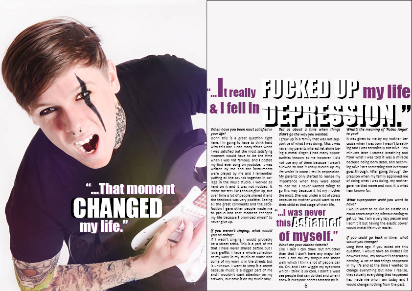
My Double page spread both challenges and uses forms of
media productions. As we can see there are many similarities between my DPS and
the case studies I have looked at. Some of them are the layout of my magazine,
the body language and the facial expressions of the model. The props used and
the makeup other denotations. I was not only just inspired by these pages, but
also inspired by some of the other DPS in the case studies I looked at. To
create the gradient effect on the right top side of my magazine, I used
Photoshop and applied the same techniques that RockSound magazine used on one
of their DPS that I will show later on another slide. Next couple slides will
show you how I used and challenges other media productions.
Here, as we can see the facial expressions are very similar.
Both Mallory Knox, Andy Sixx and my models face is scrunched up, and looks like
they are screaming. The denotation this holds is that they might be in pain. It
could also that as they are singing they might be very passionate about what
they are doing. As Metal/Rock is a type of screamo music, this might be why
magazines decide to use natural images and not planned out images. They are not
posing for the camera but doing what they are passionate about which might also
attract customers because they seem more down to earth.
Here we can see that I used a convention of a real media
production. Kerrang! And my magazine Thunder have the same layout. There are
three grids along with an intro at the top of the magazine. I decided to use
three grids instead of two because I had a lot to write about. RockSound only had
2 grids which means I did not use their layout. However, in RockSound DPS the
writing was not in Q&A form whereas Kerrang! Had a Q&A form just like
my magazine which is also another reason why I used their layout. I challenged
the convention by adding a pull quote in the centre of my magazine. Both
Kerrang! And RockSound did not use a pull quote in the centre however I did
because the centre is almost the focal point of the whole page and I thought
adding an eye-catching pull quote would make the reader want to read more to
find out more.
Monday, 7 December 2015
Wednesday, 2 December 2015
Audience Feedback Improvement
After posting my front cover, contents page and DPS on my blog i received many comments. Majority of the comments were good which meant I did not have to change a lot of things on my magazine however there were some fair improvement points.

Mark Rivas- 'I like the colour scheme of the front cover and the layout of the cover line is really unique. However some the text on the left is cut off so that should be adjusted.' Mark made a very fair point about the text that was cut off on the side. Because I was rushing to finish off my finished draft and post it I did not notice it however after seeing the comment I moved the second layer of 'BANDS!' (purple text) more to the right so that it would be more closer to the first layer which is the white writing. Also I got rid of the '!' on the purple layer to make things look clear which has made a massive difference in my opinion. In addition, I moved the writing 'Disturbing' more to the left because it was also on the line of the yellow text box which looked unprofessional.
Adrija Steniukinaite- 'your front cover looks professional! I like the layout and the font of the text. The colours you have used work well together. Maybe you could add the issue date at the top of the cover.'
Adrija pointed out that my colours that I have used work well together. I used colours on color.adobe that complimented each other and I also chose to use yellow because Kerrang! and Rocksound have used yellow too. Another thing that Adrija said is that I could add the issue date at the top of the cover. However, I placed the issue number and the date on my contents page rather than the front cover because Kerrang! magazine had the issue number and the date on contents page. There reason for this might be to not make a crowd of writing as people are usually not interested because the eye-catching part of the front cover is everything else excluding the price and other details like issue number.
Serena B- 'As someone who would read an alternative magazine, your colour scheme doesn't really appeal to me, have a look at Kerrang! and RockSound, there's just a bit too much yellow on yours'.
The reason I chose to use yellow was because both Kerrang! and Rocksound have used yellow many times before in many different magazines. The reason it may not appeal to some people might be because yellow is not necessarily a 'gothic' or a 'dark' colour. However, my model on the front cover is not a metal singer, he has moved on from metal to rock which means it was a good opportunity to use yellow rather than basic colours such as black and red. The purple next to yellow was my addition. I would have used navy blue however I did not want to copy Kerrang! directly.
Serena B- 'On your cover just refine your aligning like on the pull quote it's more slanted than the 'Fallen Angel' so put them on the same diagonal and with the 'Emerging Bands' on the right hand side.'
This is a really good point because I noticed this before I poster my draft too. The main cover line is diagonally not same as the cover lines which does not look appealing. I have made this mistake because of the lack of time as I missed many little details like this. To improve my magazine, I have diagonally made the main cover line the same as the cover lines. I also increased the size of the text to fill in negative place and added an extra cover line to also fill in the space on the left.
Serena B-'I don't really like the white background on the contents and cover, in my opinion your work is really awesome then the background is quite bland? It needs something but i'm not sure what :s'
I have tried different background colours such as grey, black and yellow and the colours I changed to did not look good on my contents page. The most suitable colour ended up being white which is why I made the background white. Black was the second option however as my front cover's background is white, and very colourful, going from vibrant colours to black was a bit too much of a difference and the contrast was not good to see.
Saturday, 28 November 2015
Friday, 27 November 2015
Thursday, 26 November 2015
Subscribe to:
Posts (Atom)


My changes- I have noticed that in magazines the website of their page is in every page. After Vanessa commenting on this I decided to change my contents page and add the website link at the bottom of the page, along with moving the page number from centre to the right side of the page. This made the contents page look a lot more professional and realistic.
Adrija: I like the colour scheme that you have used and that it remained the same through out the cover, contents page and DPS. The genre is clear from you design
Seema- I really like your magazine as the colour scheme works nicely and it all comes together very well. the font that you have chosen links to the genre and it looks good. for now i cant think of anything you could change or fix because it looks very professional and actually looks like a rock magazine.
Anieska- I really like your magazine colour scheme as it fits nicely with the genre.I think on a hold your magazine looks very professional.