Showing posts with label Construction. Show all posts
Wednesday, 2 December 2015
Audience Feedback Improvement
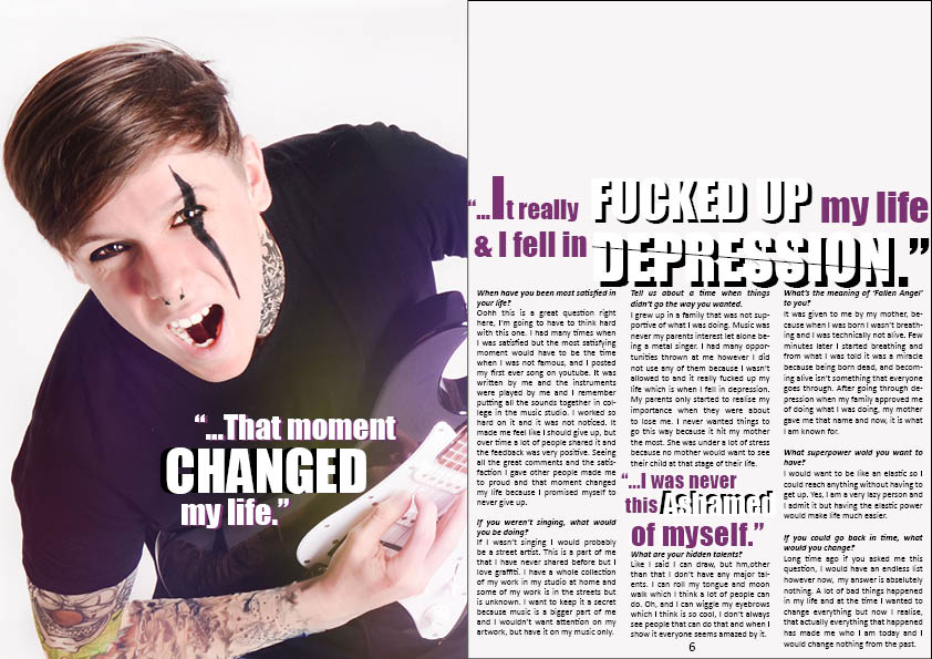
After posting my front cover, contents page and DPS on my blog i received many comments. Majority of the comments were good which meant I did not have to change a lot of things on my magazine however there were some fair improvement points.

Mark Rivas- 'I like the colour scheme of the front cover and the layout of the cover line is really unique. However some the text on the left is cut off so that should be adjusted.' Mark made a very fair point about the text that was cut off on the side. Because I was rushing to finish off my finished draft and post it I did not notice it however after seeing the comment I moved the second layer of 'BANDS!' (purple text) more to the right so that it would be more closer to the first layer which is the white writing. Also I got rid of the '!' on the purple layer to make things look clear which has made a massive difference in my opinion. In addition, I moved the writing 'Disturbing' more to the left because it was also on the line of the yellow text box which looked unprofessional.
Adrija Steniukinaite- 'your front cover looks professional! I like the layout and the font of the text. The colours you have used work well together. Maybe you could add the issue date at the top of the cover.'
Adrija pointed out that my colours that I have used work well together. I used colours on color.adobe that complimented each other and I also chose to use yellow because Kerrang! and Rocksound have used yellow too. Another thing that Adrija said is that I could add the issue date at the top of the cover. However, I placed the issue number and the date on my contents page rather than the front cover because Kerrang! magazine had the issue number and the date on contents page. There reason for this might be to not make a crowd of writing as people are usually not interested because the eye-catching part of the front cover is everything else excluding the price and other details like issue number.
Serena B- 'As someone who would read an alternative magazine, your colour scheme doesn't really appeal to me, have a look at Kerrang! and RockSound, there's just a bit too much yellow on yours'.
The reason I chose to use yellow was because both Kerrang! and Rocksound have used yellow many times before in many different magazines. The reason it may not appeal to some people might be because yellow is not necessarily a 'gothic' or a 'dark' colour. However, my model on the front cover is not a metal singer, he has moved on from metal to rock which means it was a good opportunity to use yellow rather than basic colours such as black and red. The purple next to yellow was my addition. I would have used navy blue however I did not want to copy Kerrang! directly.
Serena B- 'On your cover just refine your aligning like on the pull quote it's more slanted than the 'Fallen Angel' so put them on the same diagonal and with the 'Emerging Bands' on the right hand side.'
This is a really good point because I noticed this before I poster my draft too. The main cover line is diagonally not same as the cover lines which does not look appealing. I have made this mistake because of the lack of time as I missed many little details like this. To improve my magazine, I have diagonally made the main cover line the same as the cover lines. I also increased the size of the text to fill in negative place and added an extra cover line to also fill in the space on the left.
Serena B-'I don't really like the white background on the contents and cover, in my opinion your work is really awesome then the background is quite bland? It needs something but i'm not sure what :s'
I have tried different background colours such as grey, black and yellow and the colours I changed to did not look good on my contents page. The most suitable colour ended up being white which is why I made the background white. Black was the second option however as my front cover's background is white, and very colourful, going from vibrant colours to black was a bit too much of a difference and the contrast was not good to see.
Saturday, 28 November 2015
Friday, 27 November 2015
Thursday, 26 November 2015
Wednesday, 25 November 2015
Contents Page Progress*
For my contents page, I have carried on the colour scheme of purple,orange/yellow and black and white. I decided to use these colours because I used them on my front cover. For my masthead I used the same font that I used on my front cover because it looks more professional and connected.
My magazine relates to the case studies I have studied because used Kerrang! and Rock sound's layout on my own music magazine. For example Kerrang! had one grid and had 1 image on the left, and my contents page has 1 grid on the left and I added two images on the right one after the other. Rock sound had 1 grid on the left just like my contents page but had 3 different images on the right. This shows that my contents page relates to both of the layouts of the case studies I looked at. Also, I added a yellow/orange ribbon behind the headings of my magazine like 'Features' & 'Reviews' because Kerrang! had it too. It is to highlight to headings and separate them from the rest of the text. In addition, RockSound had the same thing but in a different colour which was red.
RockSound magazine did not have editor's message however Kerrang! did. I did not add an editor's message on my contents page because of the lack of space that I had. I wanted to keep everything simple and put together.
Starting my Front Cover using PhotoShop
In today's lesson I started creating my front cover using Photo Shop. Earlier on, I created the masthead using InDesign and also edited my models picture from adding tattoos and piercings to even adding make-up and trousers. Before I start writing about how I edited the image, I would like to add the point that I also started to create posters and edited & added effects to other images I took because I will be using them as part of the 'free posters' that come in the magazine. I used an image of my model 'Mary' and one of 'Baris' along with an image of me. I used a black paint splash as a Puff/flash because the paint splash visually looks a lot more interesting and eye-catching rather than using a circle.
To edit my image on Photoshop, I have already added a blog post about how I added piercings and tattoos and to add the Gothic black trousers, I used the exact same technique however instead of having the setting on 'Multiply', I had changed it to 'Darken' which made the image transparent but not so transparent that it blended in with the denim jeans. Another thing I done is use the 'Dodge & Burn' tools. I used the dodge tool to go over the white areas on the eye to make the eyes sparkle and also used it to whiten the teeth. I used the burn tool to make some areas of the tattoo darker and also used the burn tool to add black eye-shadow on the eye by going over the same area multiple times. I also used the burn tool to go over the bottom eyelashes and on some areas of the hair, basically all the areas I wanted a little more darker.
Tuesday, 24 November 2015
Starting Contents Page
I have recently started my contents page using InDesign. So far, I have placed my contents and the title along with my image I will be using. There are some technical things I have done before starting my contents page. For example, I have made the grids visible so I could see exactly where I placed my writings and images. Also, I added the borders so I do not go out of my page. I will be changing the font I used because I will be using 'Chiller' which looks like dripping letters as it is the font I used for my masthead and I would like to continue the use of font.
Editing Contents Page Image
Today I have started to edit an image I am planning to use on my contents page. To edit this image, I used photoshop as usual and tried something new. I added a light leak to my image which is as you can see light going from yellow to purplish blue. This suits my colour scheme which means I would continue the colour scheme from my front cover to my contents page when I start my front cover. To make the light leak transparent I changed the setting to 'Lighten' rather than 'Multiply' because I only use the second option with tattoos. 'Lighten' only made the image lighter whereas 'Multiply' makes the image transparent which blends in with the skin. I used the setting 'Multiply' on the tattoo on my models neck. I also added a septum piercing to make him look a lot more gothic as piercings are a huge part of the rock/metal sub-culture.
Thursday, 19 November 2015
Using PhotoShop to Add Tattoos


In today's lesson I started editing a photo that I am planning to use either in my contents page or on my front cover. I have not fully decided which image I will be using and that's why I am experimenting with many images.


After watching a tutorial on how to add tattoos on an image, I decided to add my own tattoos on my model because the fake sleeve tattoo that I ordered arrived too late which means my model did not get to put it on which also means I might be having another Photo shoot.
To start off I searched for 'Tattoo PNG' on google, which are tattoos with no background or just white background which means it would be easier to get rid of the background. After adding the tattoo image onto my model, I resized to image to have the perfect size. When you right click on the image, you get other options like 'Perspective' which I also used and this helped to move and change the shape of the image, e.g. bend it to make it look round as if the tattoo is going around the arm.
After resizing it I changed to the 'Normal ' setting to 'Multiply' as you can see on this image, and this made the white background disappear which means I was left with just the dark parts. Later on, I decreased the 'Opacity' to around 48% to 50%. The opacity is the quality of transparency which means me decreasing it made the image more transparent and this made everything look more realistic.
Another thing I done with the tattoos is that I used the 'Rubber tool' to rub of the parts of the tattoo that was in unwanted areas like the clothes or the background. This was one of the key important parts of the whole process because it would have looked very unrealistic and unprofessional without this step.
Monday, 16 November 2015
Starting Contents Page
In today's lesson I started creating my contents page using InDesign. I created borders around the page to prevent my images and text going out of page later on. I used the same font I will be using for my masthead which is called "Chiller". The reason I used the same font is because I want to follow the traditional font scheme and I do not wsnt to use any more than 2-3 fonts. I have decided for now that I want to keep the background white unlike most other metal or rock magazines because In a way I am challenging them. As my magazine is any type of rock genre it means it is diverse which means I do not have to make it look gothic. Other bands like Paramore and Falling out boys are still featured in rock magazines although they are not necessarily heavy which means I can be flexiable with the colours I use.
Friday, 13 November 2015
Thursday, 12 November 2015
Wednesday, 11 November 2015
Thursday, 5 November 2015
Props for my Photoshoot
I have recently ordered this fake sleeve lifelike tattoo so my model could wear it on the photo shoot day. Tattoo's play a big role in representing people and their beliefs in a way because it shows they are unique and deviant in some ways. Many rock/metal band members are covered with tattoos which shows their interests and separates them from everyone else. As my magazine is a rock/metal magazine, I will make sure my models wear either all black or all white and the main cover star wearing this sleeve tattoo.
Wednesday, 4 November 2015
Subscribe to:
Posts (Atom)


My changes- I have noticed that in magazines the website of their page is in every page. After Vanessa commenting on this I decided to change my contents page and add the website link at the bottom of the page, along with moving the page number from centre to the right side of the page. This made the contents page look a lot more professional and realistic.
Adrija: I like the colour scheme that you have used and that it remained the same through out the cover, contents page and DPS. The genre is clear from you design
Seema- I really like your magazine as the colour scheme works nicely and it all comes together very well. the font that you have chosen links to the genre and it looks good. for now i cant think of anything you could change or fix because it looks very professional and actually looks like a rock magazine.
Anieska- I really like your magazine colour scheme as it fits nicely with the genre.I think on a hold your magazine looks very professional.